Saturday, November 26, 2011

Captain Nemo's Submarine - The Nautilus

Ahoy Mateys!

Captain Nemo's underwater mechanical marvel, The Nautilus, as featured in Walt Disney's "20,000 Leagues Under the Sea", is our featured interior this week because it is a wonderous example of Jules Verne inspired "Steampunk" set design.

"20,000 Leagues Under the Sea" was released in 1954 and was a bonanza at the box-office. It won an Academy Award for its stunning special effects ( including all those underwater diving sequences ) and for its Color Art Direction. Which as you can see below, it justly deserved.

John Meehan, the art director for this film had won 3 Academy Awards in his career for such beautiful films as Sunset Boulavard, and The Heiress. During the late 1950s he turned to television set design and worked on Alfred Hitchcock Presents, The Millionaire, Soldiers of Fortune and Leave It To Beaver.

Working alongside with him on "20,000 Leagues" was Emile Kuri, a very well known set decorator of numerous Walt Disney features. This was the beginning of his long association with the studio, but prior to this film he had worked as set decorator on many, many fine pictures : It's A Wonderful Life, I Remember Mama, A Place in the Sun, Fancy Pants, A Place in the Sun, War of the Worlds, Carrie, Shane, etc, etc.

Emile Kuri will be featured in a blog entirely devoted to him, right now let's begin our grand tour of the Nautilus....


The Structure of the Nautilus

The Nautilus had three different levels : the first containing the workings of the ship ( the ballasts, pump room, and power supply ) as well as the Outfitting Room and Diving Chamber. This is where Captain Nemo and his blue crew would prepare themselves for sojourns beyond the Nautilus, such as underwater hunting expeditions, outer hull repairs, and those not-too-uncommon burials at sea.

The middle level contained the Galley, where delictable delights such a Seaweed Salad were prepared for Nemo and his guests, as well as the Passenger Cabins. For common "seaman" this was nothing more than a bunk and washstand in a room enclosed with pipes, but for more distinguished guests ( such as the Professor ) it was quite decorative with a wood carved bed, mahoghany desk, and even pictures on the wall. Ooohh.
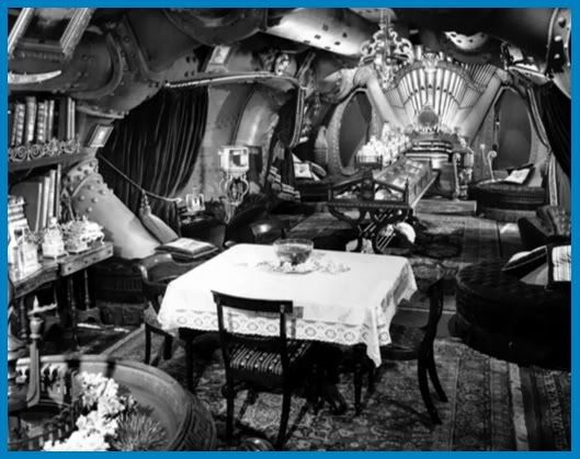
The Main Dining Room
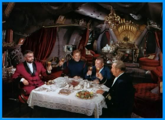
Above was the main level where the arsenel ( complete with underwater spear guns ), chart room, salon, and Captain Nemo's cabin were placed. The Salon was the plush living room/dining room of the Nautilus. It was decorated in the traditional style of the Victorian era - ornamental rugs, rich red velour sofa seats and drapes, miniature statuettes and water fountains, and in place of the common upright piano, a mighty organ graced the room.


In the center of the salon was a display case which might of included specimens from some of Captain Nemo's hunting expeditions. And beyond this was the grand feature of the salon - the circular viewing window. Although Nemo had works of art scattered throughout the Nautilus this viewing window showed the most beautiful picture of all : the wonderous world of the deep.


The Captain's Quarters

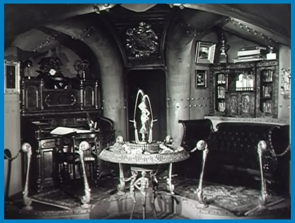
But even though the Nautilus was a beautiful submarine throughout ( albeit a bit overly iron ) the BEST decorated room of all was Captain Nemo's very own quarters. After all, it was his ship so why not have the best suite?

This lovely room was cheerful and yet quite masculine in style. Nemo slept on a traditional sea captain's bed which was a single bed atop numerous drawers ( something we all should use ). He had a magnificently ornate writing desk, a globe of the world at hand, and a map of his world - the underwater world - hanging opposite his desk.
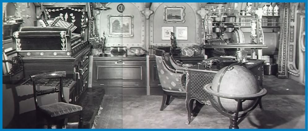
Captain Nemo's Room
If one was to step into this room one would never even think they were at sea. On days when Nemo would be feeling remorse and regret for the life he chose he could sit in his cabin and be transported once again to his home in England when he enjoyed peace and contentment, prior to his wife and children's accident.

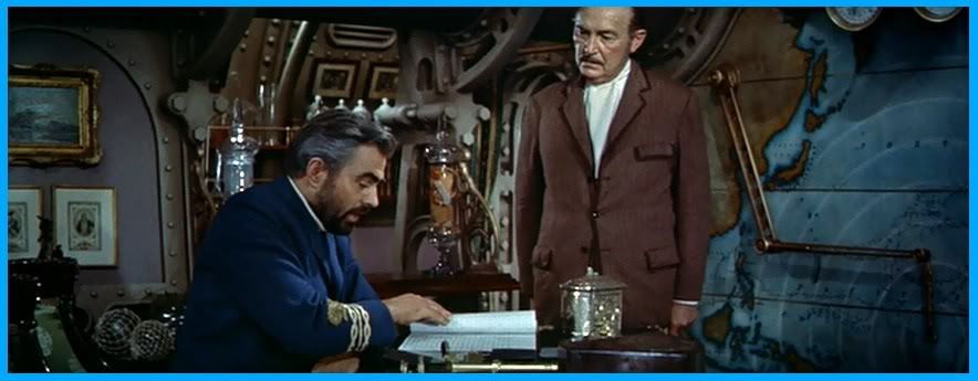
James Mason and Paul Lukas
And finally, to conclude our tour of the Nautilus is the wheel house ( shown in the topmost photo ). No ship would be complete without a wheelhouse, the only place where a captain feels truly in command and can overlook his domain.

For the making of  "20,000 Leagues Under the Sea" several different sized models of the Nautilus were made. A full-scale replica was built for the filming of the interior sequences. Shortly after the film was released, a 20,000 Leagues Under the Sea attraction opened at Disneyland. Visitors could see the largest of models on display, read about Nemo's important scientific research he was conducting, walk thru a replica of the sets used in the film, and awe at the giant squid about to attack your sub....all for only 10 cents.

Disneyland's 20,000 Exhibition
The exhibit existed from 1955-1966 and was a pleasant addition to the Submarine Voyage ride at Disneyland, where you could journey through Nemo's deep blue sea too in miniature versions of the Nautilus just like he did. Unfortunately that ride ( and the one that was built in Walt Disney World ) have both been closed down, due to a lack of modern Victorian voyagers.

The Main Salon, from the 20,000 Leagues Exhibit
The original organ used for the film can still be seen though, at the Haunted Mansion ride at Disneyland. Duplicates exist at the Walt Disney Worlds of  Orlando, Paris and Toyko ( where by golly, Nautilus rides are still popular ).

The mighty organ that played those eeeeerie tunes

Six years after "Twenty Thousand Leagues Under the Sea" premiered another version of The Nautilus was designed for Ray Harryhausen's adventure extravaganza "Mysterious Island" starring Gary Merrill, Joan Greenwood, and Michael Callan and Herbert Lom as our mysterious Captain Nemo. This one designed by art director Bill Andrews. The design of the ship was obviously copied off of 20,000 Leagues because the main lounges are very similiar in style. The "working" part of the ship was different though and included an aquarium where Nemo demonstrated a method of how the stranded passengers could rescue a sunken pirate ship and return to civilization.

Herbert Lom, as Captain Nemo in "Mysterious Island"
Numerous versions of Jules Verne's adventures featuring Captain Nemo have been brought to film, some as early as 1910. And each one of them had a unique stylization of the Nautilus, but I think Walt Disney's was the best because it captured perfectly the vision a Victorian would have of the Future in design. What's known today as "Steampunk" ( another topic we'll cover later mateys ).

The Outfitting Room of the Nautilus as seen in
Mysterious Island (1929 ) with Lionel Barrymore

Tuesday, November 22, 2011

The Wonderful World of Design

There is a world of design to be sure for Design is everywhere and all around us. The chair we sit in ( at least, the one you are sitting in ), the computer we use, the refrigerator ( with that delicious roast chicken inside just waiting to be nibbled on ), the automobile we drive to get to a community near by ( planned ), to visit a park ( planned ), to walk through its gardens ( planned )......etc, etc.  It was all DESIGNED.

Everything began as a simple idea first, and then blossomed into a plan which in trun became a reality. Not without time and effort ( and adequent funding of course ).

But " Why? ", you might ask " need things be planned or designed at all? "..... To make Life easier. Or at least, that's what all designers should strive to achieve. The old cliche words it a mite better : to make the world a better place. 

Man began with no intention of planning his home, his community, and its everyday objects and tools he uses. But in time, certain methods, certain structures, were proven to be BETTER than others and with each subsequent generation these better forms of design were improved upon and improved upon.  Design is always evolving with the times, especially since technology keeps improving and better materials are always being developed.

Designers of all fields ( industrial, interior, architectural, urban planners ) can never exist independantly because they all rely on the knowledge and latest discoveries of other designers and engineers....that new wordworking process being developed can be of use to a furniture designer, or that newly created super-strength steel material an architect can utilize for his latest skyscraper. Each one plays off of the other to help create some thing better and more useful for all mankind. ( oh, wasn't that a pretty speech? )


Louis Sullivan wrote that "form follows function" and that indeed should be the hallmark of a designers creed. No matter how beautiful an object, house, or city may look, if it does not serve to function as well, it fails to be a good design. This is especially important in industrial design. The better the function, the better that product sells. The ornamentation of it is very important too mind you, but essentially beauty does not out perform function in sales. Design must be pleasing to the eye and serve a purpose as well.

Another well-established principle of architecture and design is RELATIONSHIP - relating the areas of structure to each other and its surrounding enviroment. A design could indeed be bold and stand-out but overtime it'll come to look dated, just like a museum piece. Designs that blend into nature stand the test of time. Making sure the interior relates to its exterior is one of the first considerations an interior designer takes into account too.

Well, I think I babbled on enough now about "theory" ( such a dry subject, don't you think? ). This blog will showcase designs of all kinds - but one thing all of these designs will have in common is that they are GOOD designs. Nice strong and stable ones. But then again, you knew that already.....who'd want to showcase bad designs anyway?

Wednesday, November 16, 2011

The Start of Something New

Yes indeedee mateys, this here blog could be the start of something new and something wonderful! When you have a mind like mine, filled to capacity and running over with ideas on architecture and urban design ( in truth, ideas on how to REDECORATE America ) you need a place to dump some of those excess thoughts.....ahem, I mean share some of those thoughts with others, and this blog is going to be the space to do that.

The best place to start would be to give an outline of what we'll cover, but alas, outlines were something I never was good at making, so I'll just tell you what I believe in instead and the following posts are bound to fall in line with this thinking.

  • All design should have two important features...practicality and beauty. Or in more popular terms, Art and Function. Beauty must exist with practicality in order for any place to be pleasing to the eye and bring happiness to the heart.

  • GREENERY is all important when it comes to urban design. Trees are not only important for purifying the air but they add stability and a sense of permanence to any location. Without them we'd feel like we're living in an artificial "man-made" pre-fabricated community ...which in fact, most of us DO live in.

  • A respect for the enviroment should be evident throughout the design/construction process; buildings made energy efficient, materials made with a minimum amount of waste, and a city operating very "healthily".

  • And last but not least....ECONOMY. Yes, all these points would be of not much use to the average citizen if they are not made affordable.
And now, enough chit-chat, let's start exploring The Wonderful World of Design.